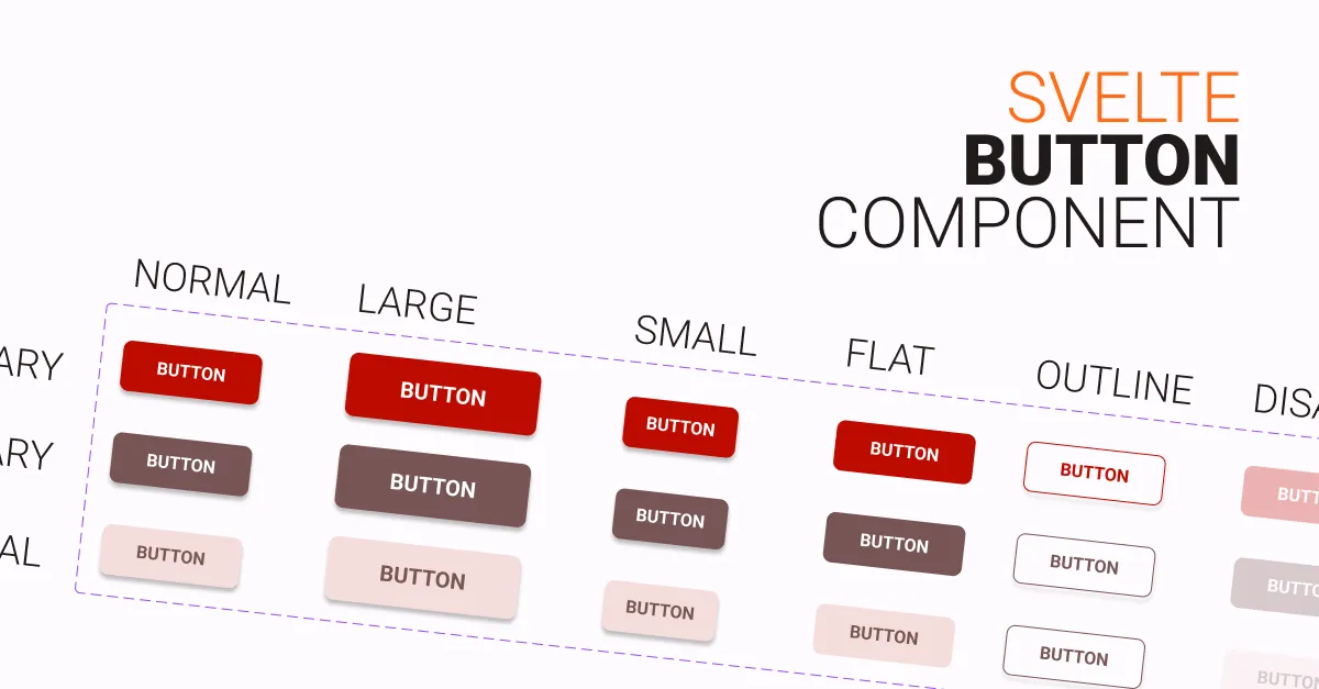
Creating a button component for Svelte can be a quick and easy way to add custom, reusable buttons to your Svelte application. In this article, we’ll go through the steps to create a simple button component that you can use in your own Svelte projects.
We will use TypeScript and SASS to create the button component (Recommended, you will get autocompletion). However, if you prefer to use JavaScript and CSS, code for that will also be included in the article. You can copy the code which works best for you and your project.
Table of contents
Playground
Usages
Save the copied code to in your components folder, preferably in src/lib/components, as Button.svelte
<script>
	import Button from 'path/to/Button.svelte';
</script>

<Button variant="primary" flat outline>Primary Flat Outtline Button</Button>
Customizing
Colors
Colors are in CSS variable, so changing them will do most of the customizing you need.
Extending
Extending the button component is also easy. For example, if you want to add a new button type that is pill-shaped or rounded, you can simply add a new exported variable in the script tag named rounded.
Then, in the style tag, add a new class called .rounded with the desired properties, in this case, border-radius.
Code
TS and SASS Version
<script lang="ts">
	export let size: String | 'small' | 'normal' | 'large' = 'normal';
	export let variant: String | 'primary' | 'secondary' | 'neutral' = 'primary';
	export let inverted = false;
	export let outline = false;
	export let flat = false;
	export let disabled = false;

	// Extending example
	// Dont forget to add the extended classType in
	// the button tag
	export let rounded = false;
</script>

<button
	class="{variant} {size}"
	class:inverted
	class:outline
	class:flat
	class:disabled
	class:rounded
	on:click
	on:focus
	on:submit
>
	<slot />
</button>

<style lang="scss">
	button {
		/* You may move the variables
    in your global stylesheet
    for better management */
		--primary: #be0b00;
		--primary-text: #ffffff;
		--secondary: #775655;
		--secondary-text: #ffffff;
		--neutral: #f4dddc;
		--neutral-text: #524342;
		--focus-ring: #857372;

		font-weight: bold;
		text-transform: uppercase;
		outline: 0;
		border: none;
		border-radius: 6px;
		box-shadow: 0 2px 4px rgba(0, 0, 0, 0.199);
		transition: box-shadow scale 100ms ease-in;
		cursor: pointer;
		font-size: 0.8rem;

		/* STATES */
		&:hover,
		&:focus {
			box-shadow: 0 3px 6px rgba(0, 0, 0, 0.199);
		}
		&:focus {
			border: 2px solid var(--focus-ring);
		}

		/* SIZES */
		&.normal {
			padding: {
				block: 1rem;
				inline: 2rem;
			}
		}
		&.large {
			font-size: 1rem;
			padding: {
				block: 1.2rem;
				inline: 3rem;
			}
		}
		&.small {
			padding: {
				block: 0.8rem;
				inline: 1rem;
			}
		}

		/* COLORS */
		&.primary {
			background-color: var(--primary);
			color: var(--primary-text);
			&.inverted {
				background-color: var(--primary-text) !important;
				color: var(--primary) !important;
			}
		}
		&.secondary {
			background-color: var(--secondary);
			color: var(--secondary-text);

			&.inverted {
				background-color: var(--secondary-text);
				color: var(--secondary);
			}
		}
		&.neutral {
			background-color: var(--neutral);
			color: var(--neutral-text);

			&.inverted {
				background-color: var(--neutral-text);
				color: var(--neutral);
			}
		}

		/* OUTLINE */
		&.outline {
			background-color: transparent !important;
			&.primary {
				color: var(--primary);
				border: 1px solid var(--primary);
			}
			&.secondary {
				color: var(--secondary);
				border: 1px solid var(--secondary);
			}
			&.neutral {
				color: var(--neutral-text);
				border: 1px solid var(--neutral-text);
			}
		}

		/* FLAT */
		&.flat {
			box-shadow: none !important;
		}

		/* DISABLED */
		&.disabled {
			opacity: 0.3 !important;
			pointer-events: none;
			&:hover {
				cursor: not-allowed !important;
			}
		}
		/* EXTENDEDING */
		&.rounded {
			border-radius: 32px;
		}
	}
</style>
JS and CSS Version
<script>
	//  'small' , 'normal' , 'large'
	export let size = 'normal';

	//   'primary', 'secondary', 'neutral'
	export let variant = 'primary';
	export let inverted = false;
	export let outline = false;
	export let flat = false;
	export let disabled = false;

	// Extending example
	// Dont forget to add the extended classType in
	// the button tag
	export let rounded = false;
</script>

<button
	class="{variant} {size}"
	class:inverted
	class:outline
	class:flat
	class:disabled
	class:rounded
	on:click
	on:focus
	on:submit
>
	<slot />
</button>

<style>
	button {
		--primary: #be0b00;
		--primary-text: #fff;
		--secondary: #775655;
		--secondary-text: #fff;
		--neutral: #f4dddc;
		--neutral-text: #524342;
		--focus-ring: #857372;
		font-weight: bold;
		text-transform: uppercase;
		outline: 0;
		border: none;
		border-radius: 6px;
		box-shadow: 0 2px 4px rgba(0, 0, 0, 0.199);
		transition: box-shadow scale 100ms ease-in;
		cursor: pointer;
		font-size: 0.8rem;
	}
	button:hover,
	button:focus {
		box-shadow: 0 3px 6px rgba(0, 0, 0, 0.199);
	}
	button:focus {
		border: 2px solid var(--focus-ring);
	}
	/* SIZES */
	button.normal {
		padding-block: 1rem;
		padding-inline: 2rem;
	}
	button.large {
		font-size: 1rem;
		padding-block: 1.2rem;
		padding-inline: 3rem;
	}
	button.small {
		padding-block: 0.8rem;
		padding-inline: 1rem;
	}
	/* VARIANTS */
	button.primary {
		background-color: var(--primary);
		color: var(--primary-text);
	}
	button.primary.inverted {
		background-color: var(--primary-text);
		color: var(--primary);
	}
	button.secondary {
		background-color: var(--secondary);
		color: var(--secondary-text);
	}
	button.secondary.inverted {
		background-color: var(--secondary-text);
		color: var(--secondary);
	}
	button.neutral {
		background-color: var(--neutral);
		color: var(--neutral-text);
	}
	button.neutral.inverted {
		background-color: var(--neutral-text);
		color: var(--neutral);
	}
	/* OUTLINE */
	button.outline {
		background-color: transparent !important;
	}
	button.outline.primary {
		color: var(--primary);
		border: 1px solid var(--primary);
	}
	button.outline.secondary {
		color: var(--secondary);
		border: 1px solid var(--secondary);
	}
	button.outline.neutral {
		color: var(--neutral-text);
		border: 1px solid var(--neutral-text);
	}
	/* FLAT */
	button.flat {
		box-shadow: none !important;
	}
	/* DISABLED */
	button.disabled {
		opacity: 0.3 !important;
		pointer-events: none;
	}
	button.disabled:hover {
		cursor: not-allowed !important;
	}

	/* EXTENDING */
	button.rounded {
		border-radius: 32px;
	}
</style>
Update 1: Added Interactive preview
Update 2: Changed .invert to .inverted
Last updated: May 1, 2023