Why Font Pairings Are Necessary
Fonts play a huge role in design. You can use eye-catching graphics, gorgeous color combinations, and other stuff in your design, but in the end, you will need text elements to convey your message.
Whether the texts you use are effective or not depends on the fonts you use. Excessive use of different fonts in the same design makes it cluttered and busy. Also, using only a single font throughout a design hinders creativity.
So, it is best to use font pairings, one of which will be used less frequently (heading, subtitle, etc.), and the other will be used for all the other texts (body, article, etc.). You may use a different font for important words to draw attention.
How to Choose Font Pairs
- Try to use serif with sans-serif: In most cases, a serif font in headings and sans-serif in body text work really well. If you are a beginner, go with this rule!
- Weight matters: Try to use a light/normal-weighted font with a bolder one. This creates a balance in the design.
- Brand?: Not all fonts are the same; different fonts provoke different emotions and yield different results. So make sure you are picking the right type of fonts according to your brand.
In this article, I have compiled some font pairings I found useful in my various projects. I hope it will help you too.
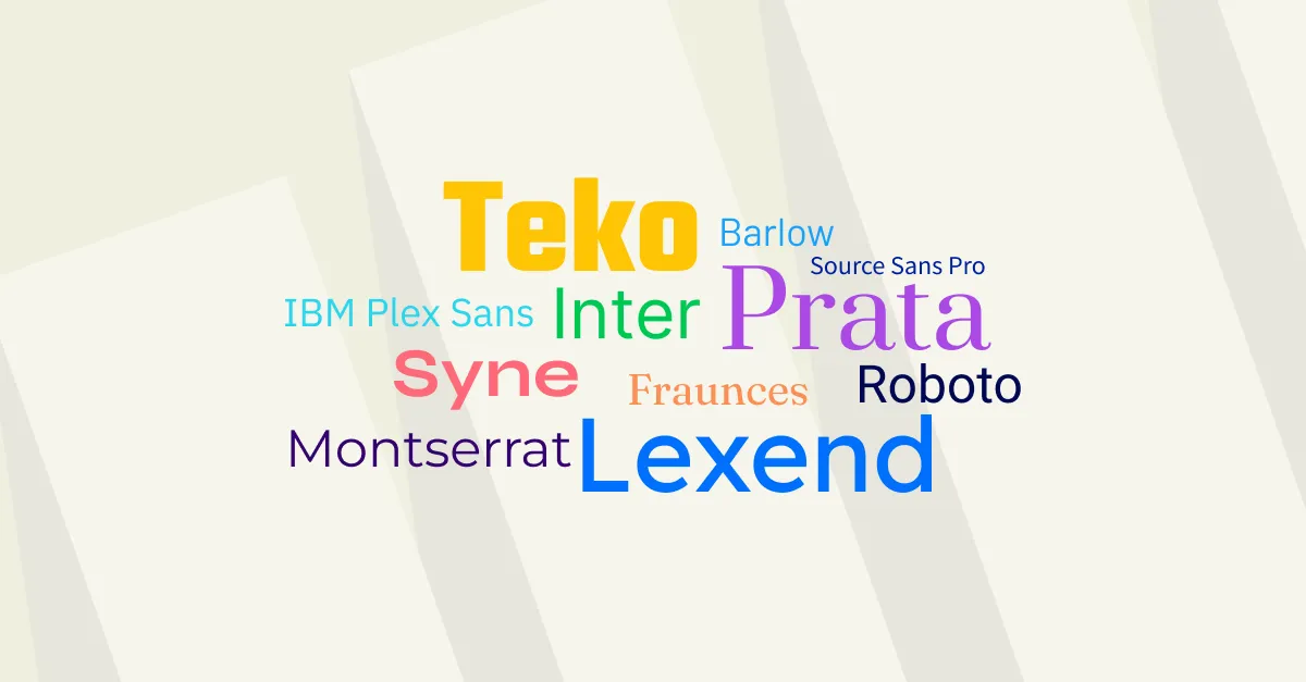
All of the fonts mentioned here are Google Fonts.
Barlow and IBM Plex Sans

Barlow and IBM Plex Sans
Accent font: Satisfy
Heading font: Barlow
Body font: IBM Plex Sans
Lexend and Prata

Lexend and Prata
Heading font: Lexend
Body font: Prata
Fraunces and Montserrat

Fraunces and Montserrat
Heading font: Fraunces
Body font: Montserrat
Syne

Syne
Syne alone is enough!
Heading and body font: Syne
Inter and Roboto

Inter and Roboto
Heading font: Inter
Body font: Roboto
Teko and Source Sans Pro

Teko and Source Sans Pro
Heading font: Teko
Body font: Source Sans 3*
Note: Looks like Source Sans Pro is not available on Google fonts right now, so I have linked to Source Sans 3 instead.
Update 1: Fixed typo in the title. Ooops!
Last updated: January 9, 2024